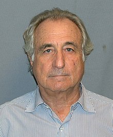
We'll resume our discussion of stock options from where we were here. The above photographed felon will come into our discussion soon enough.
Options can be part of broader strategies that limit exposure in either direction. You can combine puts and calls to create a “collar” around the market price of the underlying stock, limiting both your own profit and your own risk.
The word “straddle” has connotations
similar to “collar,” suggesting that options allow the straddler to be on both sides
of the same underlying asset at the same time. Yet “straddle” has a more
aggressive sound to it.
As it happens, Bernie Madoff used to
tell prospective clients that he was following an options-based straddle
strategy. Of course, he wasn’t following
any strategy, but he needed to sell a story, and that was it.
Such a straddle strategy, by the
way, can work when carried out legitimately. It can do roughly what Madoff
claimed that he was using it to do – produce a slow-but-steady stream of equity
market profits. But (and this is a big “but,”) it can’t do so on anything like
the scale on which Madoff claimed he was working. He had $17 billion on his
books at his height, and the options markets just don’t do the volume that
would support that much hedging.
A Hedge in Both Directions
But, since we've justified our visual, let us return from
Madoff-inspired fantasies to the real world. We spoke in the last chapter of
the intuitive risk-return trade-off, and here we’ve just described the value of
stock options as a hedge against risk. I suggest that we dig further into this
notion of risk, especially as it applies in the market for corporate equities.
Remember that risk in financial
economics is conventionally identified as the standard deviation, or the width
of the bell curve representing outcome for a portfolio within a defined period.
But we have thus far assumed that
the shape of the curve representing those outcomes is the “normal” bell. If it
isn’t, then perhaps the tails are fatter than they should be. That’s a problem,
because of course the “tail” of the curve on the left hand side of the graph
represents disastrously bad outcomes. If the tail is fatter than normal,
disasters are more likely than any calculations based upon that curve will
presume.
There are at least two different
ways in which the curves can be non-normal, yielding bigger tails. However we
draw a hypothetical curve, it will have to cover just as much space, have as
much volume within the resulting shape, as does the normal distribution,
because in any event 100 percent of the possibilities must be present and
accounted for.
The most obvious way to re-jigger
the distribution, then, is simply to flatten the curve, and make up the loss of
space by raising the tails on each side. This makes the ‘normal; result
somewhat less compelling, and the extremes, both the very big dogs and the very
small dogs, somewhat more common, while preserving horizontal symmetry – that
is, while leaving the result unskewed.
A less obvious way to end up with fat tails is
to make the bell pointier. That is, take the normal curve, move its central
point upward, and fatten the tails, while ‘paying’ for this by lowering the
shoulders. In probability terms, this indicates a situation in which the median
is more likely than in the normal curve, extreme results are also more likely,
and the moderately off-center results are less likely.
Comments
Post a Comment